Unbox Inbox is a weekly newsletter packed with packaging inspiration and observations.
However you got here, thanks for being here and welcome to Unbox Inbox. I’m Chloe, a designer with a keen interest in packaging. I’ve spent a lot of time hanging out on the internet and in grocery stores looking for inspiration for packaging projects, and aside from a few key places it’s a lot of the same. My hope for this newsletter is that it fosters inspiration and connection amongst my fellow packaging aesthetes (or aesthetes in general). The structure may fluctuate a bit as I get going, so if you’re not digging one thing or want to see more of another, let me know!
Visual Deep Dive
Each week I’ll go deep on one product or category, and for this first issue it only felt right to go all in on one of my favorite things to consume–chocolate. There are of course the Hershey’s and Tony’s Chocolonelys of the world, the bars you’ve already seen or impulse bought while standing in line at the grocery store. But what I get excited about are the smaller brands that catch my eye when I’m on a mission for something else entirely. I once went to Scandinavia for a week and came back with no less than 15 different chocolate bars, which I stored in my chocolate drawer like the chocolate enthusiast I am.
For this issue, I went down the proverbial rabbit hole (my camera roll, Pinterest, Instagram collections, etc.) in an effort to see if I noticed any common design choices in chocolate bar packaging. Here’s what I found:
I. Clean color-coded flavor
Chocolate inherently is not colorful, so it’s no surprise the majority of chocolate brands lean hard on bold colors to differentiate between skus. The bulk of brands I researched for this letter take this approach, so it clearly works. I myself have purchased 13 of the below brands because the branding or packaging caught my eye.
II. Kraft paper/”natural” vibes
Leaning on a material that cues “natural” to wrap chocolate bars makes sense, as chocolate is a processed food (even if the ingredients are simple). There’s definitely an understated elegance some of these designs impart too–not all packaging has to scream on the shelf.
III. Fun (illos, patterns, type-driven etc.)
This is admittedly a bit of a cop out for a third category, but you get the idea. Not to say that any brands in the above two categories don’t utilize patterns or type or FUN, but they’re more secondary to the overall design system. In the case of the below, the package design goes all in on a design element beyond a solid color or the material.
Any brands doing a killer job designing chocolate bar packaging that I missed? Send them my way (their site that is, but if you want to send chocolate too…).
New News
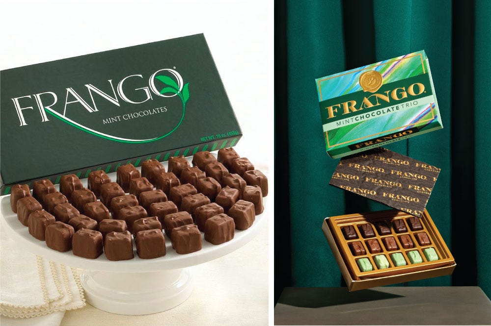
In semi-niche news, the Chicago classic Frango Mint got a fresh new look from the people at Altura Design. What do you think? Call me old fashioned but I’m partial to the original. It’s probably a nostalgia bias–I ate boxes of these as a child of the 90s in suburban Chicagoland.
Packing Peanuts
(Those loose leftover pieces at the bottom of the box)
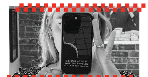
My David Shrigley phone case (pictured at the top) is also an actual chocolate bar you can buy. Procure some of the chocolate bars featured above from my favorite spots: online at Bar and Cocoa or Cocoa Runners, or irl at Chocolate Covered (SF) or The Meadow (NYC & PDX). A 2.2 lb brick of ceremonial-grade cacao if you aren’t messing around (can confirm this makes a perfect non-caffeinated morning bev). Dr. Bronner’s is making soap and chocolate, but Dove is making soap and the other Dove is making chocolate (I kind of always thought they were the same…). Love how GLAD uses the real estate on the chocolate bar itself. Cocoa-free chocolate is a thing, but the first ingredients listed are vegetable fat, carob, and oat mylk barley (gluten)–woof. How did I completely miss that Mikkeller had a chocolate brand? Maybe it’s coming back? Someone please tell me it is.
Thanks for reading <3 Have any feedback on my first issue? Reply to this email.


A well designed chocolate bar will always get me! I’m a sucker for Compartés’ design